Wednesday, November 3, 2010
Sunday, October 31, 2010
Layar Model and Yahoo Pipes
Monday, October 25, 2010
Final Vitra Model
 Internal shot of the model will the materials added, but with no furniture, i plan to do the furniture within 3ds max, my next step will be putting the model into layar and finding it in the site location at uni.

 These are some images of the final Vitra Outlook on sketch up with all the materials added, in the later stages i will be exporting my model to 3ds max to reduce the poly count and putting some rendered views on my blog, the choice of materials or combination of materials is a question, there might be some materials i could be changing.
Wednesday, October 20, 2010
Week 12 Independent Task - Model
 This is an internal shot of the model, the above ceiling with windows are elevated to its original positioning, down lights will be used to get more out of the building, notice i havent put any furniture or anything, this will be done in the later stages of the model.

 These are some final images of the Vitra Outlook, but within these images i havent added any materials, just a white model, the next stage im going to be applying the images in sketch up and then importing the model to 3ds max to do some rendered views of the model.
Above are angled, top, and side views, within these views i tried to enhance the original shapes and keep them at its original state, in a digram will be showing the original model and the pieces that i took from the model.
Week 12 - Studio Task - 500 Word Text
The Vitra Outlook
The Vitra Outlook, design inspired by one of many architects, Frank Gehry.
With his design of the Vitra Design Museum, two of the main elements were taken from the Museum to design the Vitra Outlook, many styles and shapes were implemented into that museum so therefore experimentation of the combination of styles was of great importance to its contribution of the design.
Situated within the rocky canyons of the desert, the Outlook provides remote and ashtonishing views for the home dweller, the home can mainly be constructed upon rocky cliffs and remote open area locations. With the surrounding environments open desert type area with the ocean just at the bottom of the cliffs, also with the rocky surroundings and harsh look of minor vegetation.
It gives the home owner a sense of persoal space and open type feeling.
The external components to the house itself is made from different type of materials, but all mainly recycable, the wall cladding itself is made from a hardwood timber that treats itself was a type of water-proofing for wet weather, the rubber is used under the wall cladding also used as a water method for no water penetration. The external construction itself is made up in a way where it stands out from the surrounding environment.
Internally as said before, the construction is made up in one storey the east part of the home the bedroom and other amenities while the other the kitchen, family lounge rooms and overlooking outdoor views, the main access to this home is located under the bigger part of the building, under is a outdoor stair case that has been mounted upon a large concrete structure, this is used as a form of support for the main building itself.
The stairs itself is made of an aluminium material that reacts as a non slip material.
The rest of the house itself is all divided up to its allocated sections to provide major sunlight during the winter and minor sunlight during the summer.
Overall the building itself with its contemporary design is something different but in many ways a home that stands out, in relation to the Vitra Design Museum the minor aspects that have been taken from the main building itself has not kept its original shape, but has been extruded and edited in a minor may.
As final the Vitra Outlook offers the modern design that catches attention to the human eye.
Week 11 - A1 Montage
These are just some sample draft posters of my layouts that i plan to use, within my final design i plan to enhance my design by just using these layouts as a guide, rendered views of the model will be done in 3ds max to create a more real type of environment, also the text and videos will be edited to suit the posters design.


 These are just a bunch of ideas for my design of the Vitra Outlook, will the combination's of all materials and images i have found and researched.


 These are just a bunch of ideas for my design of the Vitra Outlook, will the combination's of all materials and images i have found and researched.
Thursday, October 7, 2010
Week 11 - Independent Task - Draft ideas
 With these two images, the above and the bottom are my ideas that were set for the model, i had an idea to create a home that is canter levering off the end of the cliff, the images with my montage is where i had got my theme from, with these selected components of the model, i plan to embed and create the home.
These are just some minor ideas of my model, in the later stages i will be presenting more of my progressing model.
 ___________________________________________________________________
 This is an overall image of the design, within my research of different type of homes on the internet, ive decided to call it the Vitra Outlook, for the home will be situated upon a rocky type cliff that i will be modeling in crysis and exporting the design of the home to the engine.
Most of the materials chosen to design this building will be implemented in the later stages.
 The internal part of the model, within the internal part i dont plan to model everything, just the main fixtures such as bathroom fixtures and some minor elements, there will be more internal shots of the Vitra design, showing most of its layout and style.
 This is a shot of the progressing model, there are some feature that i have changed due to its problematic shape, but this i had overcome, within this shot is on section of the home, within this curved shaped layout will be a kitchen/ relaxing dining area, some of the window types have been constructed.
 This is my starting basis of the model, there were only 2 shapes i chose to take from the original Vitra to design my house, the 2 shapes are taken in the shot above both having there differences in design layout and style, with this i am going to incorporate the materials chosen onto the model to design a lighthouse type home.
Week 11 - Studio Task - A1 Indesign Poster Layouts
 Source:
http://www.sfmoma.org/artwork/109627
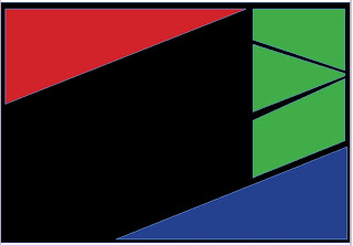
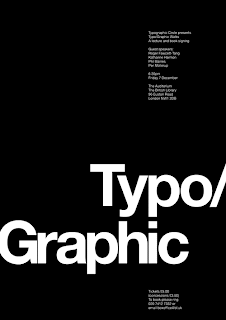
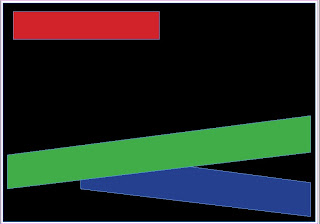
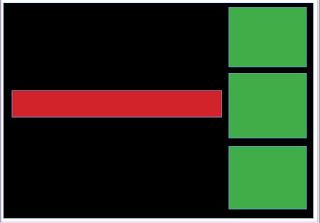
These are just some poster designs from the internet, in which i plan to merge the ideas to create posters similar to these designs, below are the simple layouts presented for the design.
 Red area will contain, main heading and also
information on the design, the green areas
will have still images, the blue area will contain
the animation, while the black background
will have an overall image.
Wednesday, October 6, 2010
Final Textures

My ideas with these abstract textures is to create with them an abstract house, with the inspiration of Kendrick Bangs Kellogs and the form of his buildings, i plan to create a home that is blended in with the surrounding environment, that is cantilevered and raised from the ground.
In relation to these textures, they all have there different type of design and formation so therefore constructing these elements into the model should create something different.
Wednesday, September 29, 2010
Final Model of Vitra Design Museum
Thursday, September 23, 2010
Week 9 - Independent Study - Vitra Design Museum
 This is an example of an open house design where most of the elements of the environment are being implemented around the building. These designs below will be a source of inspiration to my designing of the vitra type open home.
Ideas with re-inventing the Vitra Design Museum
The design of this building is quite complex, the different shapes curves make the building into something different, the ideas that i plan to embed are to divide it up into different sections, each component can be divided up into different shapes, i plan to re-arrange the shapes into different areas of the building, put it all together and design a different building.
When the final outcome is finalized the ideas are to view it in as a wire frame structure to edit it to, either stretch the structure, explode, angle, move or rotate the building to not make it its basic shape.
I see this shape as an open type of building, where editing the walls and roofs to make it an open area, also can be seen as a open house in an open area with a landscape environment, this is only a basis of my ideas and this will be further researched more .
http://www.wearesuperfamous.com/tag/architecture/page/2/
http://www.ecofriend.org/entry/eco-home-modularean-ethical-and-asthetical-piece-of-architectural-craftsmanship/
http://www.archdaily.com/74614/ad-round-up-beach-houses-part-iii/
Week 9 - Independent Study - Frank Gehry
FRANK GEHRY - Case Study : Marques De Riscal Hotel
Case study Building: Marques De Riscal Hotel
Architect: Frank Gehry
Location: Elciego, Rioja, Spain
Status: Completed in September 2006
The Marques De Riscal Hotel is design by renowned architect Frank Gehry constructed with ribbons of titanium in rose, gold and silver this is to represent the red wine, bottle netting, and classic Marqués de Riscal label, for the hotel is situated within a wine country area. This unique piece of architecture, brings attention to travelers for it offers both visual and illuminant experiences. Winery's within this region are not open to the public, but to redefine and invigorate its public image, Marques de Riscal commissioned the design to provide experience for visitors to the winery.
Settled in the area of the "City of Wine".
The Marques De Riscal Hotel, is located in the winery of Vinos Herederos del Marques de Riscal in Elciego, the Rioja region of spain, and is one of the oldest wineries in the region.
The design of the exterior part of the building itself is a series of rectilinear elements, clad in sandstone, it was a combination of pink titanium as material and with a finish of mirror stainless steel, the skin hung over a series of giant squares of black rock with metallic wings, this is Gehry's trademark with using masses nof glass panels that is placed at different angles.
According to Gehry the exterior colors reflect the colors of wine.
The silver is meant to be the foil that covers the cork, while the gold itself is a representation of a zig zag mesh that covers all of the Marques de Riscal bottles.
The main entry to the plaza leads to the reception area and then to the bar, this is all situated along the edge of a small area of the vineyards. The outdoor part of the building has a small pool and a covered walkway extending from the building, this allows for visitors to over look the main views of the surrounding region.
Internally the offices and meeting rooms for staff are all located adjacent to the building and are both linked to the main building and to the winery offices and production facilities.
Divided through three levels, with 14 guest bedrooms, wine tasting rooms with a restaurant including a public dining room, a private dining room and outdoor dining terraces and many more other facilities.
Source:
http://lioninoil.net/blog/2007/11/19/marques-de-riscal-hotel/
http://www.arcspace.com/architects/gehry/riscal_winery2/riscal2.html
http://lioninoil.net/blog/wp-content/uploads/2007/11/marques_de_riscal_exterior.jpg
http://www.designboom.com/weblog/cat/9/view/8825/frank-gehry-city-of-wine-complex-marques-de-riscal-hotel.html
http://www.dailymail.co.uk/travel/article-1244505/Guggenheim-architect-Frank-Gehry-create-City-Wine-complex-Marques-Riscal.html
Week 9 - Studio Task
Group Members: For the Vitra Design Museum by Frank Gehry
Patricia Javier - http://patriciajavierarch1390-2010.blogspot.com/
Nicon Sanchez - http://niconsanchezarch1390-2010.blogspot.com/
Ben Aquino
 This is the final stages of the model where all we had to do was connect,
all of the abstract shapes together, there were some lines missing but
eventually the model added up.


 The beginning stages of the model both the ground floor and first floor
walls were raised.

Patricia Javier - http://patriciajavierarch1390-2010.blogspot.com/
Nicon Sanchez - http://niconsanchezarch1390-2010.blogspot.com/
Ben Aquino
Design in Progress
 This is the final stages of the model where all we had to do was connect,
all of the abstract shapes together, there were some lines missing but
eventually the model added up.


 The beginning stages of the model both the ground floor and first floor
walls were raised.

Wednesday, September 15, 2010
Subscribe to:
Comments (Atom)


