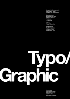
 Source:
http://www.dominicbusby.com/typographicwalks.html
 Source:
http://www.sfmoma.org/artwork/109627These are just some poster designs from the internet, in which i plan to merge the ideas to create posters similar to these designs, below are the simple layouts presented for the design.
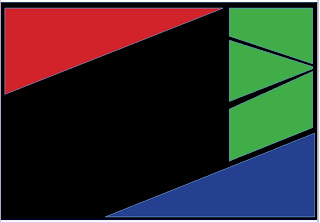
Red area will contain, main heading and also
information on the design, the green areas
will have still images, the blue area will contain
the animation, while the black background
will have an overall image.
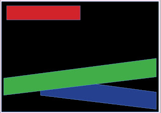
Black specify s the overall image of the design whilst,
any where on the black area will have some text
red has the main title of the project, green contains
still images and the blue will have images and a video.
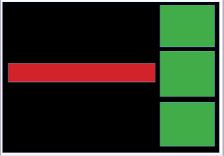
Black will have the main image, red has the main title
two of the green boxes will contain still images while
one box will have the animation, while the main text
can be placed anywhere on the black area.
 Source:
 Red area will contain, main heading and also


No comments:
Post a Comment